Back to Components
Magic Animated Motion Button
Component

Magic Animated Motion Button

CodewithLord
November 22, 2025

This component is a visually appealing animated button that uses 3D geometric elements. On hover, the button scales up and geometric shapes (cone, torus, icosahedron, and sphere) appear and move around the button, creating a dynamic magic motion effect. The button also has a blurred gradient shadow that appears on hover, enhancing the 3D illusion.

Husky Dog Animation CSS

This component is a visually appealing animated button that uses 3D geometric elements. On hover, the button scales up and geometric shapes (cone, torus, icosahedron, and sphere) appear and move around the button, creating a dynamic "magic motion" effect. The button also has a blurred gradient shadow that appears on hover, enhancing the 3D illusion.


1<!DOCTYPE html> 2<html lang="en"> 3<head> 4 <meta charset="UTF-8"> 5 <meta name="viewport" content="width=device-width, initial-scale=1.0"> 6 <link rel="stylesheet" href="styles.css"> 7 8 <title>Magic Animated Motion Button | CodewithLord</title> 9</head> 10<body> 11 12 <a href="#" class="button"> 13 <span class="button__text"> play </span> 14 <img src="img/cone.png" alt="" class="button__cone" /> 15 <img src="img/torus.png" alt="" class="button__torus" /> 16 <img src="img/icosahedron.png" alt="" class="button__icosahedron" /> 17 <img src="img/sphere.png" alt="" class="button__sphere" /> 18 </a> 19 20</body> 21</html>

Explanation: Place the following HTML inside your plain HTML page:

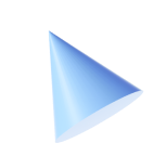
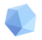
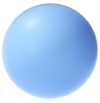
a class=button span class=button__text play /span img src=img/cone.png alt="" class=button__cone / img src=img/torus.png alt="" class=button__torus / img src=img/icosahedron.png alt="" class=button__icosahedron / img src=img/sphere.png alt="" class=button__sphere /


CSS Code


1@import url("https://fonts.googleapis.com/css2?family=Montserrat+Alternates:wght@700&display=swap"); 2 3:root { 4 --first-color: hsl(217, 75%, 80%); 5 --body-color: hsl(211, 100%, 95%); 6 7 --body-font: 'Montserrat Alternates', sans-serif; 8 --normal-font-size: 1.25rem; 9} 10 11* { 12 box-sizing: border-box; 13 padding: 0; 14 margin: 0; 15} 16 17body { 18 height: 100vh; 19 display: grid; 20 place-items: center; 21 background-color: var(--body-color); 22 font-family: var(--body-font); 23 font-size: var(--normal-font-size); 24} 25 26a { 27 text-decoration: none; 28} 29 30.button { 31 position: relative; 32 background-color: var(--first-color); 33 color: #fff; 34 padding: .9rem 2.20rem; 35 border-radius: 3rem; 36 transition: .4s; 37} 38 39.button::after { 40 content: ''; 41 width: 80%; 42 height: 40%; 43 background: linear-gradient(80deg, 44 hsl(217, 80%, 80%) 10%, 45 hsl(217, 85%, 70%) 48%); 46 position: absolute; 47 left: 0; 48 right: 0; 49 bottom: -4px; 50 margin: 0 auto; 51 border-radius: 3rem; 52 filter: blur(12px); 53 z-index: -1; 54 opacity: 0; 55 transition: opacity .4s; 56} 57 58.button__text { 59 position: relative; 60 z-index: 10; 61} 62 63.button img { 64 position: absolute; 65 inset: 0; 66 margin: auto; 67 pointer-events: none; 68 transition: .6s; 69 opacity: 0; 70} 71 72/* Move 3D geometric elements */ 73.button__cone { 74 width: 18px; 75 transform: translate(-25px, -6px) rotate(55deg); 76 filter: blur(.5px); 77} 78 79.button__torus { 80 width: 38px; 81 transform: translate(7px, -14px) rotate(80deg); 82} 83 84.button__icosahedron { 85 width: 36px; 86 transform: translate(34px, -4px) rotate(-45deg); 87 filter: blur(.9px); 88} 89 90.button__sphere { 91 width: 30px; 92 transform: translate(-5px, 15px) rotate(40deg); 93} 94 95/* View shadow gradient */ 96.button:hover::after { 97 opacity: 1; 98} 99 100/* Button scale */ 101.button:hover { 102 transform: scale(1.3); 103} 104 105/* View 3D geometric elements */ 106.button:hover img { 107 opacity: 1; 108} 109 110.button:hover .button__cone { 111 transform: translate(-38px, -10px) scale(1.2); 112} 113 114.button:hover .button__torus { 115 transform: translate(7px, -32px) scale(1.1); 116} 117 118.button:hover .button__icosahedron { 119 transform: translate(50px, -20px) scale(1.1); 120} 121 122.button:hover .button__sphere { 123 transform: translate(-14px, 20px) scale(1.1); 124}

Explanation

CSS Breakdown

Root Variables:

--first-color: main button color

--body-color: page background

--body-font: Montserrat Alternates

--normal-font-size: default font size

Button Base Styles:

Positioned relative for layering images.

Rounded with 3rem border-radius.

Smooth transition for scaling and hover effects.

Hover Shadow (button::after):

A blurred linear gradient appears underneath the button.

Controlled opacity transitions to appear on hover.

Geometric Elements (button img):

Positioned absolutely in the center of the button.

Initially invisible (opacity 0).

Each element has a unique transform (position, rotation, blur).
Hover Animation for Images:

On hover, images become visible and move to new positions.

Each shape scales slightly for extra depth.
Button Scale:

Entire button enlarges smoothly to 1.3 times its original size on hover.

Magic Animated Motion Button Images


Here are the images used in the button:

Cone Torus Icosahedron Sphere

Love this component?

Explore more components and build amazing UIs.

View All Components